After researching codes and conventions of a generic opening sequence, titles and credits are a component that is found in every one is some shape or form. Therefore, we could make the decision to add titles and credits into our opening sequence. To do this I decided to conduct research into typical fonts and genre specific method of integrating them into an opening sequence effectively.
Fonts:
Firstly I decided to look at existing fonts that have been used in existing opening sequences.
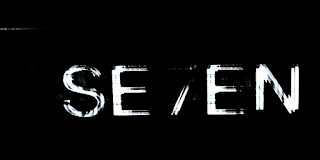
First I analysed 'Se7en'. When looking at the font I realised straight away it had been made white to contrast the black background and make it more prominent. Compared to the low key lit background (which we also know is a convention of thriller films) it made what was going on in the background even more uneasy to watch as it appeared to be even harder to see in contrast. Also, when looking specifically at the font chosen it was not a block font. It was almost 'scratchy' and 'scruffy'. This links to the narrative of thriller genres being unconventional and difficult to interpret.


The next film I looked at was 'Lady in a Cage'. This was consistent with the first film I looked at as it was also white. However, this time the font was more generic and appeared to be quite formal. However, there were aspects that make it appear to be unique with some words being different sized fonts and some letters joined and linked to one another and others not. Instead some are placed in and around the other letters.

'The Girl With A Dragon Tattoo' again conformed to what I had found in the previous opening sequences in the way that the typography was white. However this font conformed more to the font used in 'se7en' in the way it wasn't conventional. Some letters appear to look more like symbols that letters and are placed and positioned differently to challenge a typical font. This makes it unique and the use of symbol like letters can suggest the mysteries and challenged within the narrative.

Finally, 'Run Lola Run' again used a white font. Although the titles are in a different language, it confirms that the thriller genre has stereotypical fonts used within it. This inconsistent font (in the way that all letters are of a similar font but there is no pattern in the way they are formed other than they are imperfect) is similar to the fonts I had found previously.

Secondly, I decided to analyse positioning of the lettering:
After watching all the opening sequences and studying the fonts, I realised there were consistencies throughout all of them based on the positioning of the lettering. In each opening sequence each title and credit was positioned in the frame corresponding to another aspect. For example many were integrated above or under a horizontal line. This meant the font blended into the shot more and almost seemed like a part of it. Also, the size of the font was similar in each opening sequence as it never took up the whole of the frame and was never too small so you didn't notice it. It was sized in according to other objects within the frame to make it proportionate but still never the key image.
How this has helped me:
Font: after analysing the font it became clear that it is a code for thriller films to use white fonts as this was consistent throughout every opening sequence I looked at. The font itself, although being less consistent throughout the opening sequences), always had a sense of imperfections. Eg. the letters had rough edges, were almost symbols rather than letters appearing unrecognisable and different shapes and sizes of letters within a word. However, despite this the font was still consistent throughout each opening sequence n the way that the font didn't change, there were just minor variations within the font chosen. Therefore, when creating my opening sequence I will be careful when picking a font that I chose a 'battered' effect around my font and make it white. However, to challenge the typical thriller genre expectations, I could chose a more typical bold font. This could change the viewers expectations of the film from the outset as a bold typical font is not associated with the thriller genre, suggesting everything is fine at the beginning of the film.
Positioning: The positioning of the typography was integrated into each frame in a variation of ways however, it was always integrated into a object or key feature within the frame so it never stood alone. Also, the lettering was always proportionate to the other objects within the frame. This is useful as it confirms that when we create our opening sequence we can have creative freedom to integrate our credits and titles into our frames in whatever way we want as long as we are careful not to make them the key focus of our frame. Also we can do whatever we would like in terms of editing the transitions of the credits as some opening sequences use fades, cuts, swipes etc. If we wanted to challenge the conventions however, we could change the proportions of the lettering within the frame depending on the significance, danger, superiority of the characters etc.
The fact that the opening sequences I analysed were all sub genres of the thriller genre but had the same conventions makes this analysis vital to us as it will be relevant to whatever sub genre of thriller we decide to use.
How has this helped me:
this has helped me as I now know the typical way credits are integrated into an opening sequence. This has helped me develop some ideas on ways I can integrate my own credits as although the credits are always horizontal across a screen, they're never exactly the same. For example I could place my credits behind objects in the screen so they appear to swipe across as it represents things being hidden. This would make our opening sequence unique and suggests plot event for the rest of the film as the audience infer they are being hidden from something.


